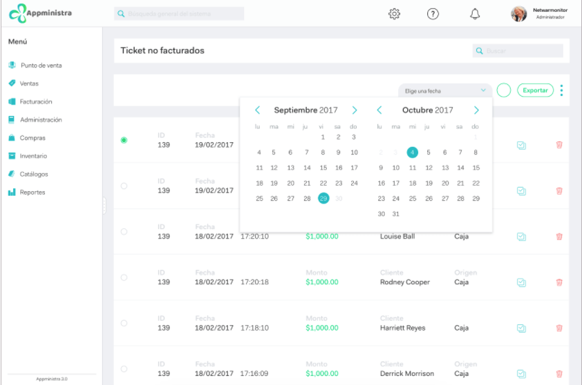
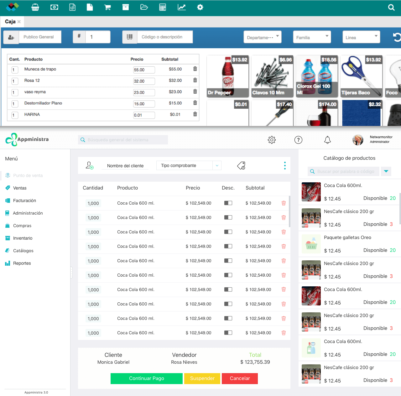
Appministra

UX/UI Web App Redesign

Comprehensive point of sale and inventory management software solution for MSMEs, agile, intuitive and easy to use. It helps to control, monitor, increase productivity and save time and money, always reacting immediately to quick sales and meet the needs of businesses, with real-time information.

feature

Before & After

Project background and challenges

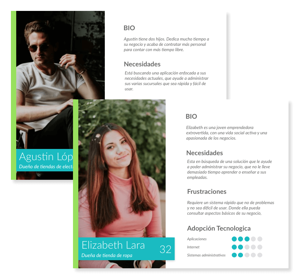
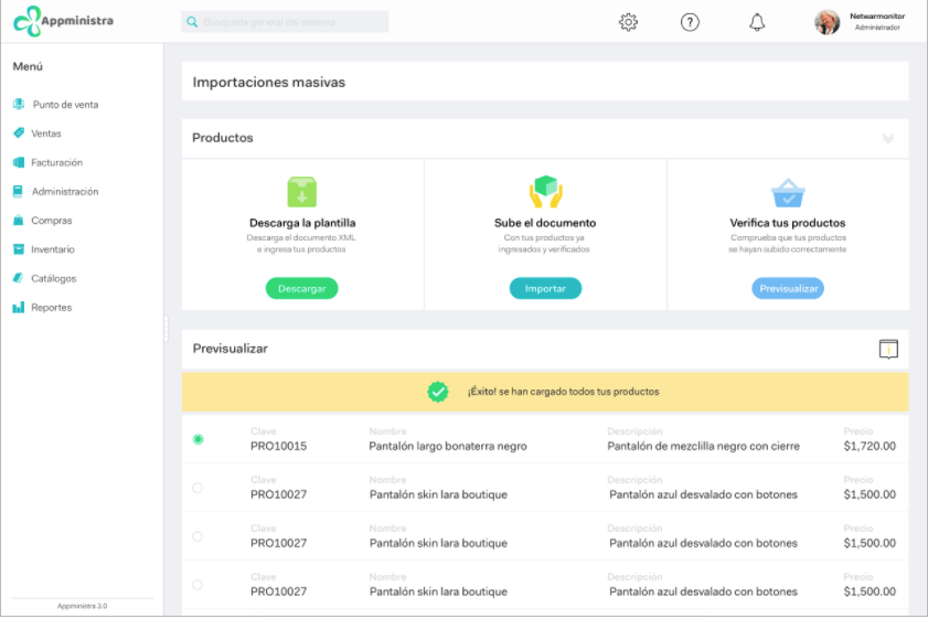
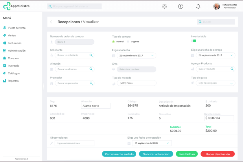
Appministra was a point of sale application with attractive functions for clients who owned small businesses. However, we received constant calls requesting support and complaints. This resulted in clients who preferred to stop using the system.
The Marketing and Design teams suggested implementing UX, something which had not been done until then. None of us had previously worked with UX methodology or with Sketch, but we had an opportunity to learn during this project.
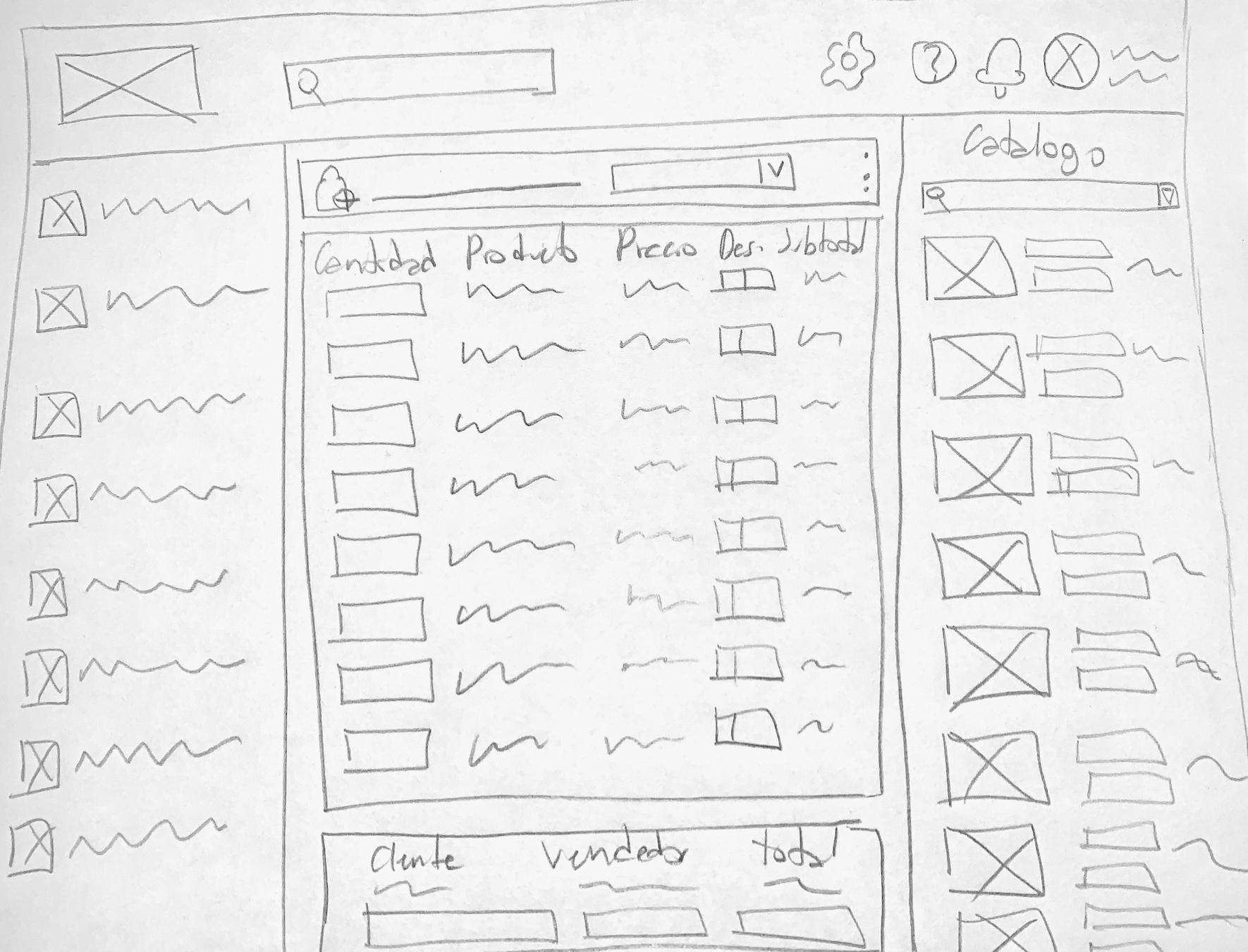
Due the urgency which it was required (one month), there was no time to implement several methodology phases. However, we were able to work with new users who validated the design by usability testing.

Personas

When we started working on the project, we had very little time to fully develop all stages. However, we did create Personas to be able to do our work based on them.
Its creation was based on marketing data regarding the leads profiles we had received. We were able to establish key aspects in common which resulted in two well defined profiles: one was the customer with a small or newly open business and the other was a growing customer who had several businesses. Their needs, profiles and required solutions were different. Appministra had a version for each of these profiles.

feature

Design System

We implemented a basic design system from the very beginning, using only fonts and colors. As we moved ahead with the project, more elements were added to the system such as titles, active and inactive buttons, information cards, icons, etc.
There were several versions of the same design since it was updated whenever a more practical solution was found to create more screens in less time. This was achieved by standaring elements based on the Atomic Design. At that point, we updated with the new design all the elements we already had.

feature

Mockups

Because it was a full system redesign we made several mockups with different options, especially for screens that did not work due to the way information was distributed.
There were key screens to define things such as the system start screen. In this case, space was distributed in such a way it was possible to have a broad product list and to have basic functions in the most accessible way possible.
We decided to change the main menu to the bottom left hand side and configured it to hide, as to have extra space.
The product list became more relevant and the actual product catalog size was reduced, that way it was possible to show which products were sold the most. Also, this resulted in the possibility of making product search faster to add products into the system.
Screens that were more of a challenge in this redesign were those which had more information, since information previously had a compressed aspect or the actual font was too small. This is the reason for which we chose to redesign and change column orientation, which in turn made text easier to read.

Usability Testing

Usability testing was carried out with people who had not previously used a system of this sort. We used as base the guerrilla user testing and we requested them to carry out basic tasks in order to detect usability errors.
The age of the people who were interviewed was between 20 and 38 years old, had businesses of their own or were about to start one and had basic to intermediate knowledge in terms of internet app usage.
Some of the questions that we made were:
How do you add a product? How do you configure your account? How do you create an invoice? How do you apply filters to the reports?
We also asked them to evaluate the system in terms of design, ease of use, contents and usefulness.
Once the tests were finished, they had positive results and most participants were able to carry out the requested tasks. Thanks to their feedback, we were able to make final adjustments on the platform.

feature
feature
feature
feature

Logo redesign

When we started working on the final prototype, we realized the current logo was not doing anything for us anymore since it had a very outdated look.
Taking this into consideration, I worked on logo redesign. What was most important was keeping its design with organic shapes, but at the same time making it adaptable for use on diverse digital platforms such as the new web page, app and sales point system.