Parflix

UX/UI Mobile App

Parflix can help us discover a series or movie based on joint statistics related to our preferences in terms of series and movies.

feature

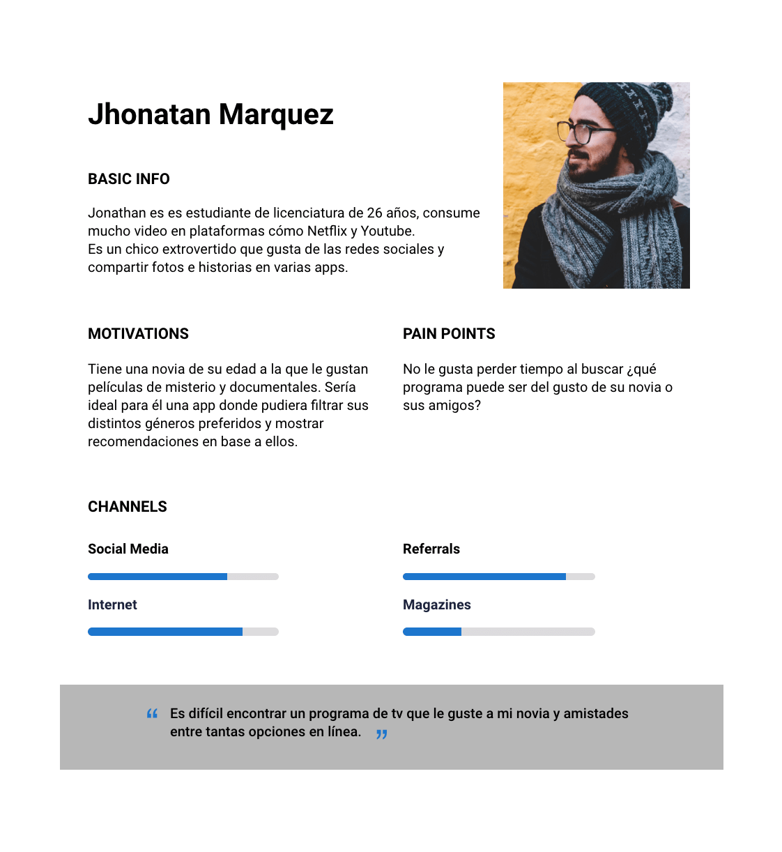
Project background and challenges

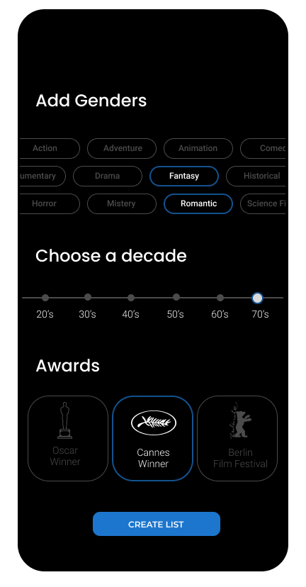
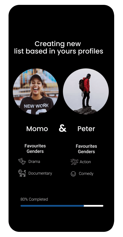
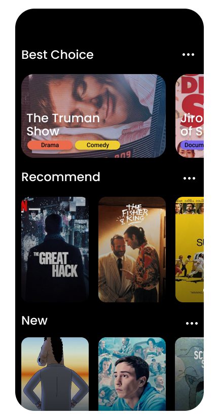
Choosing what to watch on a video streaming platform with hundreds of options is not as simple as it seems. Making up your mind can take a while and even once you pick something, maybe it is not to everyone's liking. This is why an application such as Parflix is necessary. Parflix can help us discover a series or movie based on joint statistics related to our preferences in terms of series and movies. I am the main designer for this project.

Personas

At the very beginning, when working on the main idea, we thought it should be an app for couples only. However, we realized that it could be used for a wide variety of profiles such as friends or partners. The persona was defined with a young profile, an avid social media user looking for a quick and agile fix when it comes to finding content that matches diverse profiles.

Persona 1: Jhonatan Marquez

BASIC INFO Jonathan is a 23 year old college student who consumes a large amount of content from platforms such as Netflix and Youtube. He is an extroverted guy who likes social media and sharing photos and stories on several apps.

MOTIVATIONS He has a girlfriend of his same age that likes thrillers and documentaries. He also likes these genres but he also likes comedies. It would be ideal for him to have an app where he could pick his preferred genre and receive recommendations based on his preferences.

PAIN POINTS He does not like to waste his time when it comes to picking out what to watch. Which show can be liked by his girlfriend or friends? User Quote: It's hard to find a tv show that both my girlfriend and group of friends like, among all the options available online.

feature
feature

Design System

Before creating the Design System, we created the Parflix logo which resulted in a main color palette and the design line we would follow. We decided on a Dark UI taking into consideration the current app trend of them being in dark colors, which resulted in an interesting challenge when it came to color contrast without saturation or without it being bothersome for users. Taking this into consideration, we added color tones both on shading and movie categories so the app would not be so monochromatic. The protagonist elements in the app design are the actual movies, therefore we opted for large card formats which also coincides with current trends.

Wireframes & user flow

Several wireframes on paper were made and this helped us define elements such as main screens, menus and app flows. Redesign was avoided on several screens since we defined everything on paper beforehand.

APP User Flow

Once the app starts, it is necessary to synchronize it with Netflix. Once the app is synchronized, it shows which profiles are available on the account and gives the option of adding more accounts on the login to synchronize it with other friends apps. Afterwards, it is necessary to pick which accounts are to be compared. The limit is 5 accounts for comparison. Then, the app processes the information and automatically creates the following lists: Best Choice, Recommend, New, Random. These lists can be edited, deleted, other elements can be added or mark certain content as “seen” so it is not recommended again. For each movie in particular there is a brief synopsis available.

feature

Prototype

We continued with the design process using available mockups. It was a challenge to work with Figma for the first time, however, once I found the necessary tools required for this job, everything flowed faster and easier. The project is available at this link:

Usability and validation testing

A usability test was performed to obtain quick results. Users with diverse demographic profiles were asked to use the app with the prototype link in the Figma mobile app. The prototype was previously tested so users would not be limited to the available options. However, this took some time since each movie had to be an additional screen. These tests were recorded on video individually for each user.

feature
feature
feature
feature

What were the lessons learned on this project?

Parflix is an app that originated from an idea I had, since I usually struggle when it comes to deciding which movie or series to watch with my boyfriend. Parflix is an app with only one functionality, but since it is possible to include customized lists and categories, its functionalities can be expanded and later on add other streaming platforms. Used apps: Figma for design and prototyping.